Using charts in Dynamics
Charts
A chart is a graphic representation of data from multiple records in a view. They are built from a query on the data, and when the data is updated, the associated charts also get updated automatically. Several different types of charts can be created within Dynamics, the most common being column, bar and pie charts.
Charts are available for all views on Dynamics. Multiple charts can be added to a view, but only one can be displayed alongside the view at any one time.
There are two types of charts:
- System charts - these charts can only be created by System Administrators and are visible to all users who have access to the view.
- Personal charts - these charts can only be seen by the users that create them, or by the users these charts are shared with.
The links below take you to the information you need to use Charts:
Viewing charts
Show chart
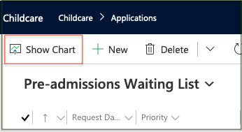
Click on the 'Show Chart' icon displayed on the top ribbon of a List view.
This will open a chart panel by the side of the list and display a pre-defined chart. The 'Show Chart' icon will change into a 'Hide Chart' icon.

Hide chart
Click on the 'Hide Chart' icon or the X in the top-right corner of the chart panel to hide the chart panel.
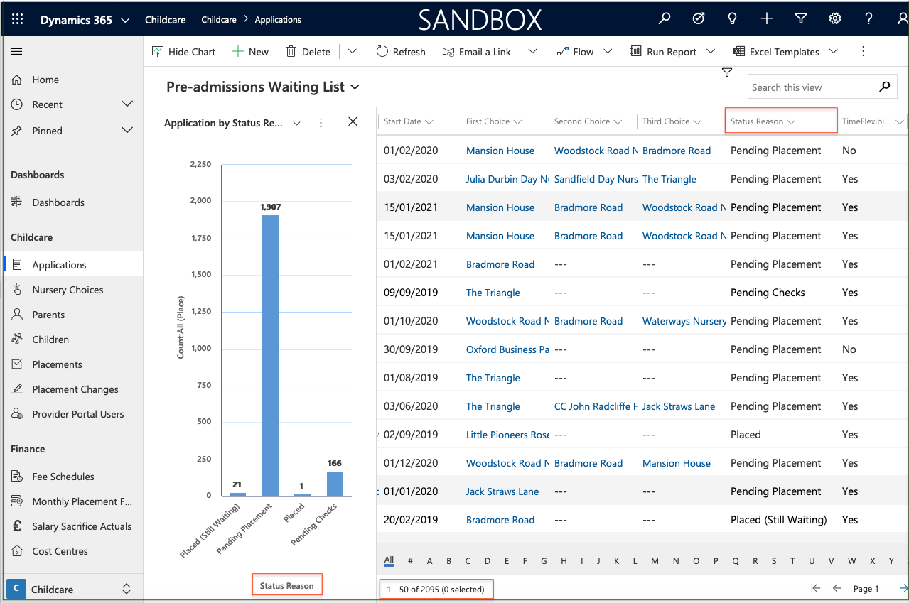
Example chart, analysed by Status Reason
This shows a graphical representation of the number of records for each Status Reason value in the list.
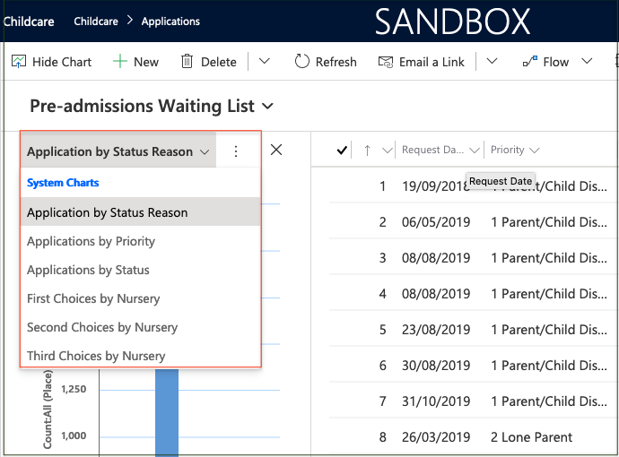
To display a different chart for the same view, click on the down arrow by the chart name and select the required chart from the list.
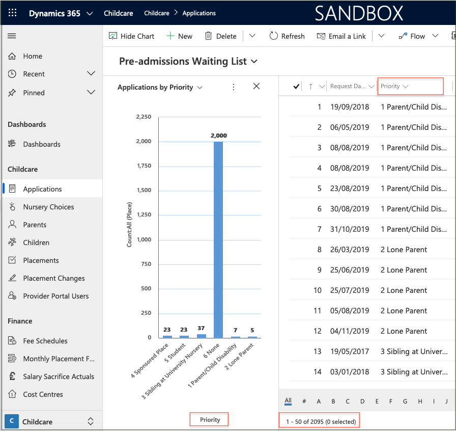
Example chart, analysed by Priority
This shows a graphical representation of the number of records for each Priority value in the same list.
View filtered list
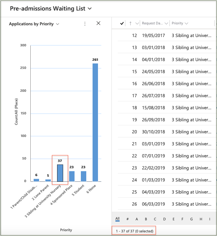
Clicking on an category in the chart will filter the list to display only those records in that category.
In this example, clicking on the bar for Priority 3, filters the list to show only those 37 records.
Drill down in a chart
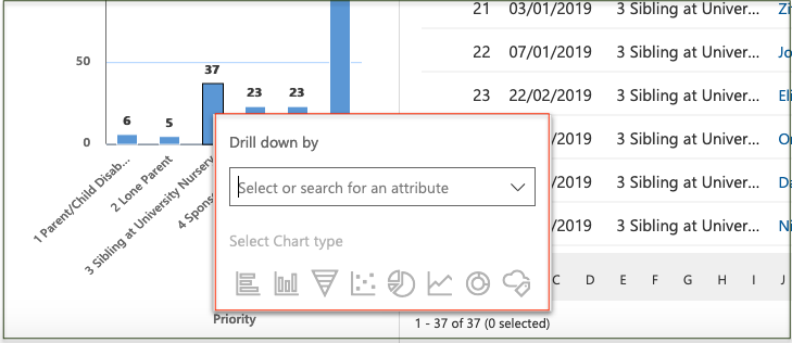
Clicking on a category in the chart will also display a Drill down panel where an attribute and Chart type can be selected to display a new chart.
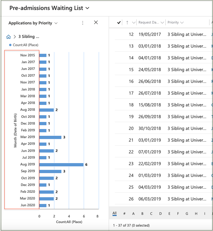
In this example, the new chart shows the Priority 3 records grouped by Month of Birth.
Click on the 'Home' icon to return to the previous chart.
Chart options
While viewing a System Chart, clicking on 'More Commands' will display a dropdown list of options for selection.
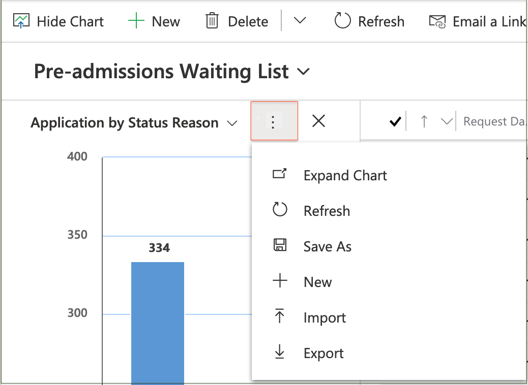
'Expand Chart' will display the chart in a new expanded window.
'Refresh' this is recommended to re-synchronise the chart with the data if it has been idle for some time.
'Save As' enables you to save a Personal chart with your own Name and Description.
'New' enables you to create a new chart, as described below.
'Import' enables you to browse for a chart definition file (in .xml format) and import it.
'Export' enables you to save the chart in .xml format.
While viewing a Personal Chart, clicking on 'More Commands' will display a dropdown list with additional options for selection.
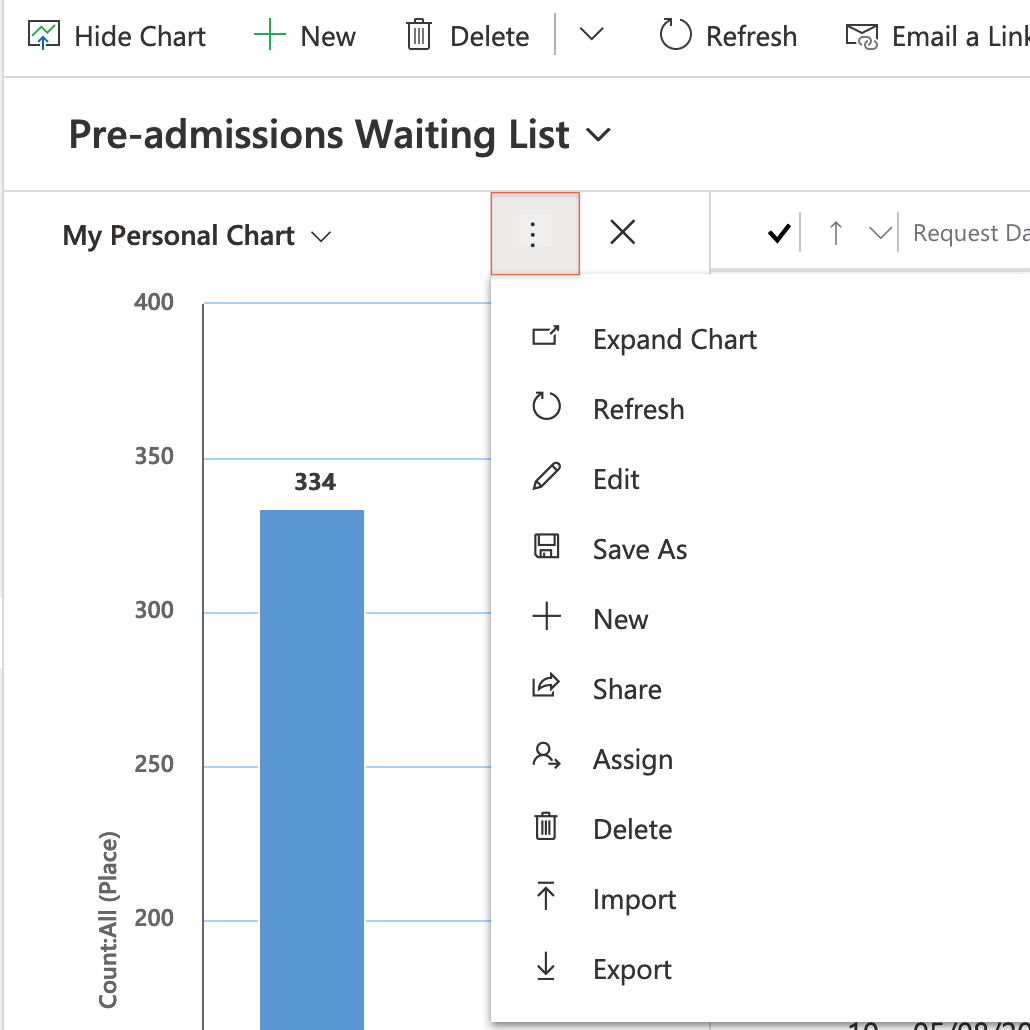
'Edit' enables you to change the chart, as described below.
'Share' enables you to share the chart with users or teams, as described below.
'Assign' enables you to assign the chart to yourself, or to another user or team, as described below.
'Delete' will remove the chart after confirmation.
Creating basic charts
A message is displayed if no charts exist for a list view, then clicking on 'More Commands' will display a dropdown list with two options for selection.
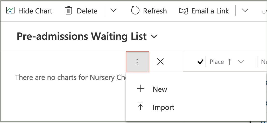
'New' opens a form in a new window to design a new chart.
'Import' enables you to browse for a chart definition file (in .xml format) and import it.
Chart designer form
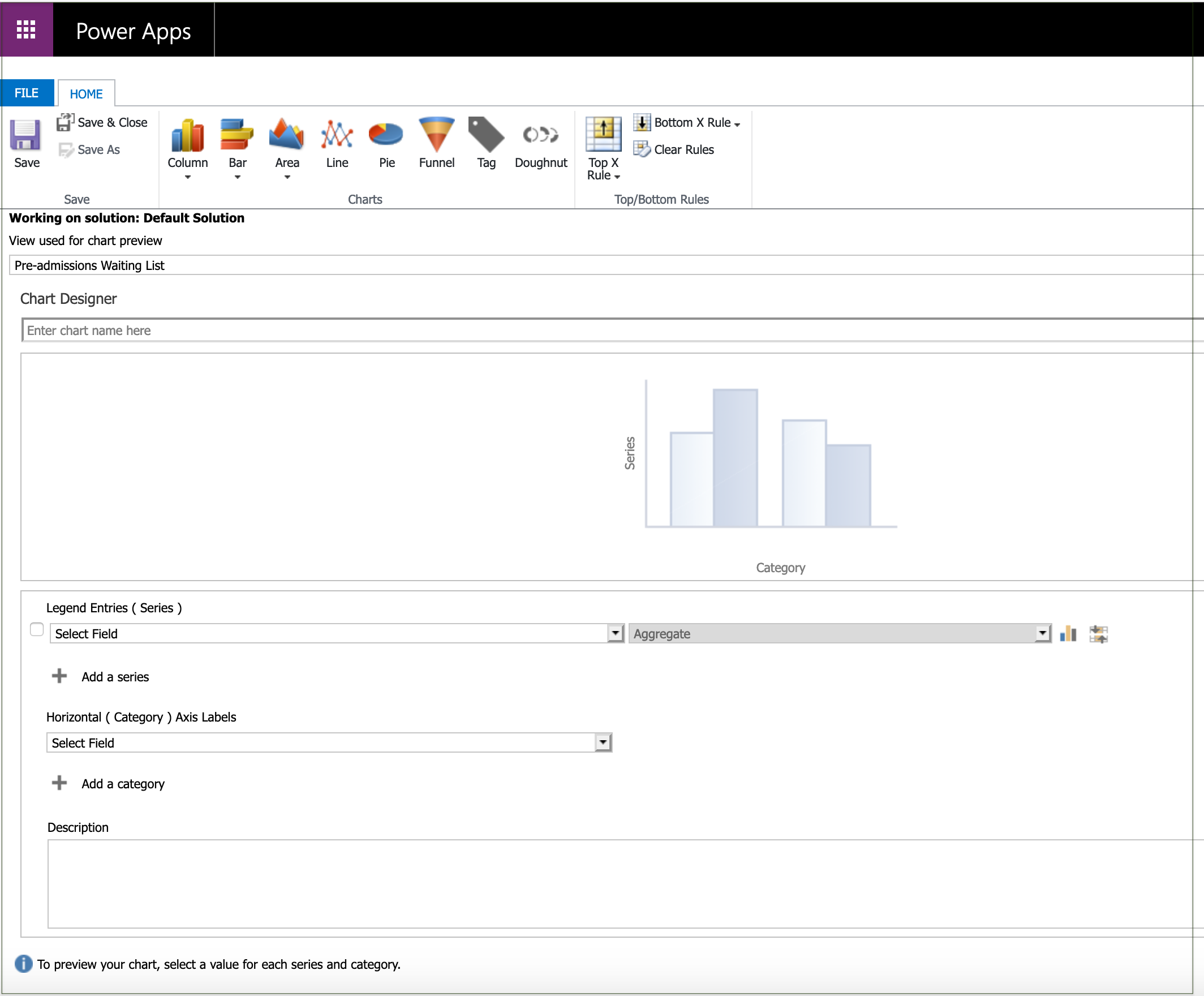
First, select the type of chart to be created.
Select chart type
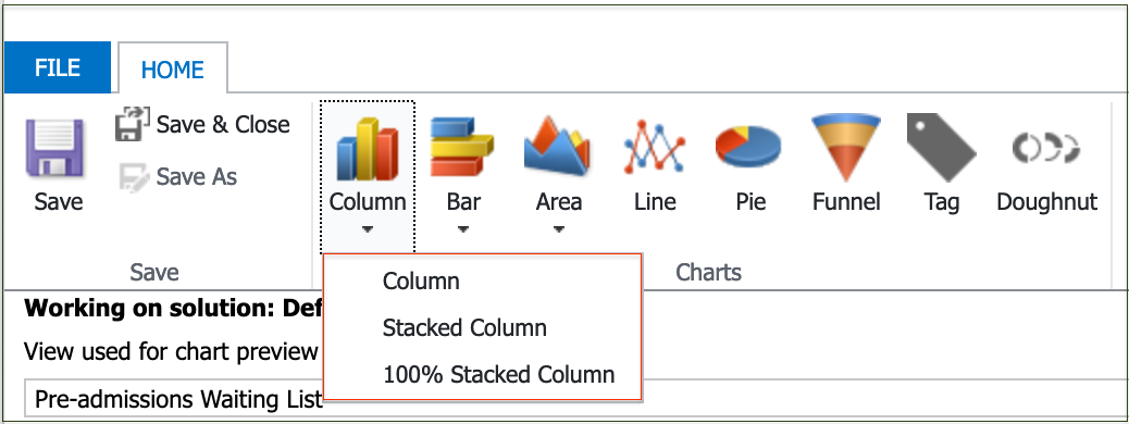
Clicking on the down arrow below a chart type will display the stacking options for bar, column and area charts.
Chart layout
The selected chart layout will be displayed showing the Series and Category positions for a Pie Chart in this example.

Select Series Field
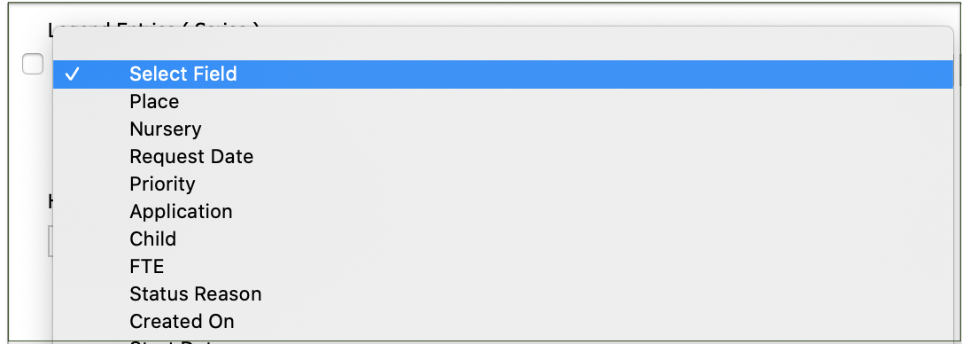
Clicking on the down arrow in the first Select Field will display a list of fields in the view.
Select the field that is required for the 'Series' axis in the chart.
Select Aggregate
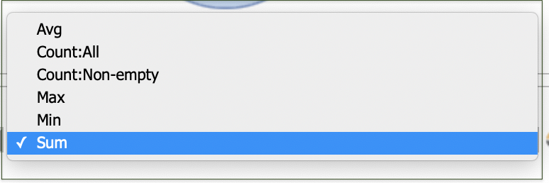
The Aggregate dropdown will then be enabled to select the option by which to group the 'Series' field. The options available will vary depending on the format of the chosen Series field, i.e. for non-numeric fields only 'Count: All' or Count: Non-empty' are available.
Select Category Field
Repeating the field selection for the 'Category' axis will then display a preview of the resulting chart. The Aggregate dropdown will be displayed where applicable for the chosen Category field.
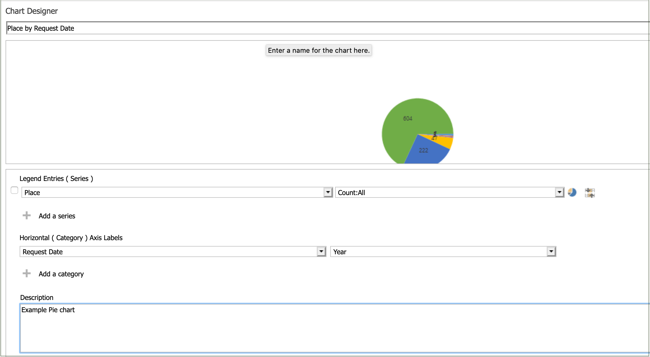
Note that the Chart Name will default to show the 'Series by Category' field names selected, and can be overwritten with the required name.
An optional description can be added if required before Saving the chart.
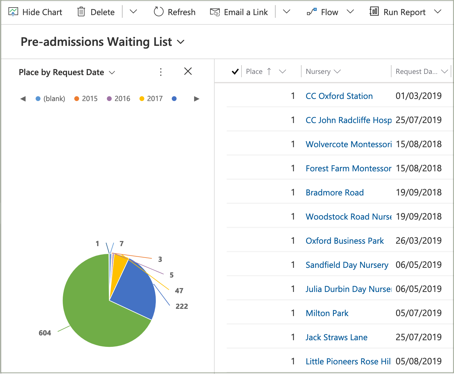
Display new chart
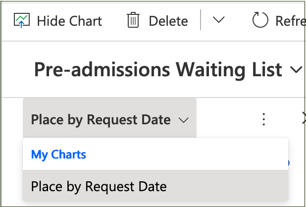
Returning to the list view and selecting 'Show Chart' will display the new chart name under 'My Charts' for selection.
A pie chart will be displayed with a colour key representing the 'Category' field, i.e. the 'Request Year' in this example.
The numbers will represent the 'Series' field, i.e. a Count of all Places per year in this example.
Additional chart features
Top and Bottom rules

To display only the top items on the chart, select 'Top/Bottom Rules' icon > 'Top X Rule'.
OR
To display only the bottom items on the chart, select 'Top/Bottom Rules' icon > 'Bottom X Rule'.
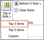
Then select the number of items to be displayed: 3, 5 or 'Custom' to specify a different number.
For example, to display only the top 3 values of the Series, select 'Top 3 items'.
Comparison charts
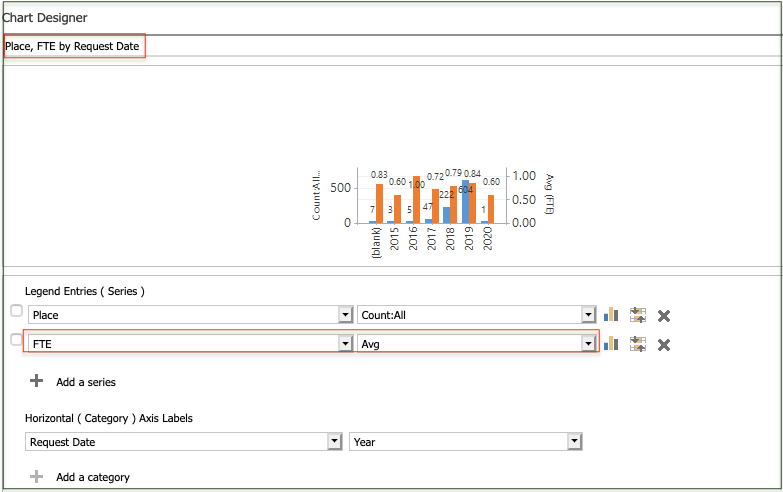
Depending on the chart type you can select additional 'Series' and/or 'Category' fields to show them together on the same chart.
In this example, the count of Places and the average FTE are shown side-by-side per Year.
Editing charts
To edit your personal chart, display the chart to be changed and select the 'Edit' command.
The 'Chart Designer' form will open in a new window, displaying the current properties.
Any of the properties can be modified and then Saved.
A personal chart can also be edited by a shared user with Write permission.
'Save as' will create a copy of the chart with a new name.
Sharing charts
To share your own personal chart, display the chart to be shared and select the 'Share' command.
The 'Share user chart' form will open in a new window.
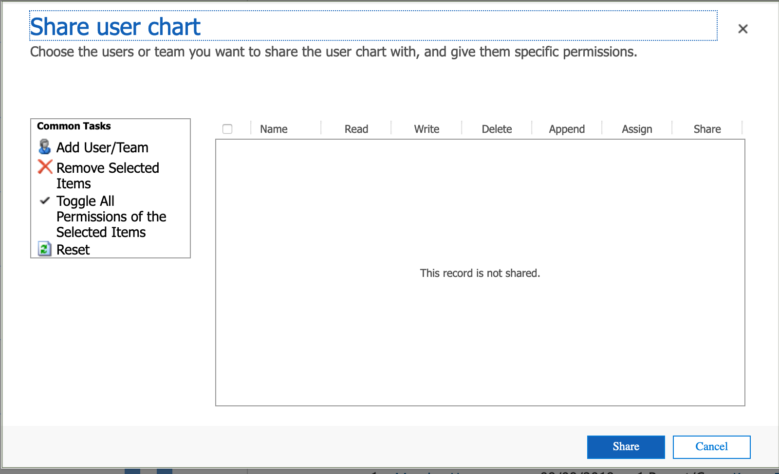
Add the User(s) and/or Team(s) that the chart is to be shared with, assign their specific permissions and click on 'Share'.
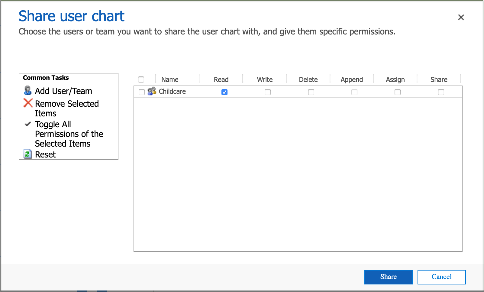
The permissions can be removed or changed at any time by re-selecting the 'Share' command.
A personal chart can also be shared by a shared user with Share permission.
Assigning charts
To assign your own personal chart, display the chart to be assigned and select the 'Assign' command.
The 'Assign user chart' form will open in a new window.
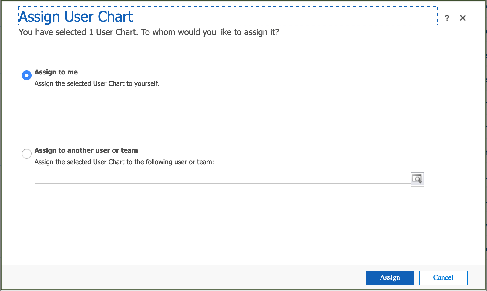
Select the User or Team that the chart is to be assigned to, and click on 'Assign.
A personal chart can also be assigned by a shared user with Assign permission, either to them self or to another user/team.


